
Roberto said I should post here to request any feedback on leaflets. I want to get 10,000 printed. Does anyone have any ideas or want to contribute?
Leaflets (Design)
@Trevor_Oakley was suggesting leaflets that speak about real, local community issues that everyone can relate to. For example: housing, crime, the environment, transport, welfare, heath issues, or other relevant issues - such as the millions of UK children in poverty.
I think one of the prior steps is deciding on our Call to Action - what will the flyer ask people to do? E.g. visiting the website? We need to plan our “ladder of engagement” in order to be able to measure the success of our promotional activities.
I have more thoughts for this that need to be developed, I’ll post as soon as possible. Anyone reading this, please feel free to jump in the discussion, especially with ideas regarding the flyers!
@Trevor_Oakley: Regarding local issues: it’d be great to have a list of very specific issues in your constituency, particularly if you’ve already identified them. E.g., how many children are in poverty in Westcliff? This could go on a separate thread.
Broken down, these would be the steps to get the leaflet out there:
- Decide on content: Which specific issues? What solutions does MP propose for those specific issues? Why?
- Decide on CTA: What should the reader be moved to do? Why?
- Create design: @Diarmuid_Russell can probably handle this if he’s available.
- Print them out: This needs to be decided on in terms of where, how much and how the costs can be spread out.
- Measurement: How will success be measured?
As per my emails - I think early leaflets need to focus on recruitment and identify with real issues. Key issues today are housing, immigration, foodbanks, high taxes, crime. Housing is especially a significant issue and also the high taxes imposed now.
Leaflet ideas from @Trevor_Oakley:
Ideas I
- Overbearing state - represented by a large background or a big cloud
above- Bridges to fruit but being broken by bolts of lightening with words on
them such as discrimination, inheritance, background- Burdensome taxes - eg rock on the backs of working people
I think there needs to be a centre object to focus the reader and then
objects around that. Possibly bridges could come from the centre object. It
could be some people huddled together try to find somewhere better but
being stopped because the bridges are broken.
I think the leaflet should show how people have their lives inhibited
because rich people who control the state do not allow people to pursue
their natural talents.
Idea II
- Centre object is a person who suffers from discrimination, eg in a
wheelchair, or who has a bad home environment- The person at the centre is being attacked by sharks with words like
discrimination on them which are jumping from the surrounding areas- A path out is blocked by a big gate guarded by a ape with the word
state on his chest.- Possibly the man is being hanged by taxation.
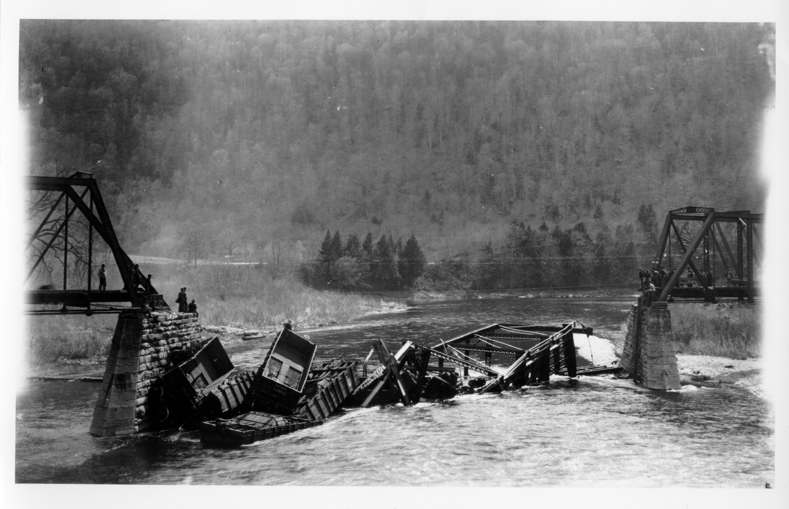
These are just some ideas. I attached an image of a broken bridge to show
what I am thinking about.
Whether any inspiration can be found from this Site I don’t know. This is more the Activist Site for Meritocracy to get people actively supporting change. Be good for many more to join this as well: http://themovementrebooted.org/ and http://themovementrebooted.org/activism-ideas/
http://themovementrebooted.org/m-day-the-day-of-rage/
http://themovementrebooted.org/the-armory/
In fact have a good look around the site as the two need to be interchangeable in the sense of introducing people to each other. One is activist recruitment the other the politics that put it all together. Thoughts?
Steve
I see change as a “process” and I think what really matters is the destination. In a world in which thousands of children die from starvation every day, and one which has homeless people begging just miles from a mansion, then something is seriously wrong.
The religionist will quote John (The Devil rules the world), the philosopher will quote ideals about corruption, and the pragmatist will quote details of new programs to help.
But what is needed is leadership. If a Party cannot even organise a leaflet, then the Party is a long way from any kind of power.
These may inspire a few ideas for leaflets, or banners perhaps?
Steve
The leaflets are generally powerful and the graphics are very good.
I have some suggestions as follows:
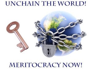
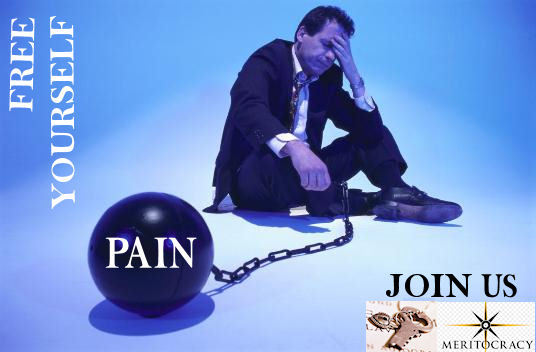
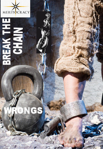
- The chain one: the padlock locks the world and the key is in the air. I think the chains should fetter PEOPLE and the key is held by them (showing we can change our lives if motivated).
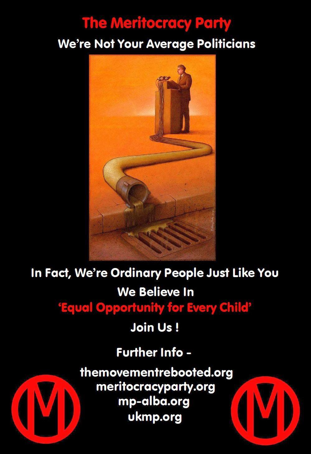
- The drain one has a very powerful idea behind it. I think the “average person” referred to in the caption should be visually shown with a contrasting image (MP words are enlivening people, other political words only fit for the drain and journalists).
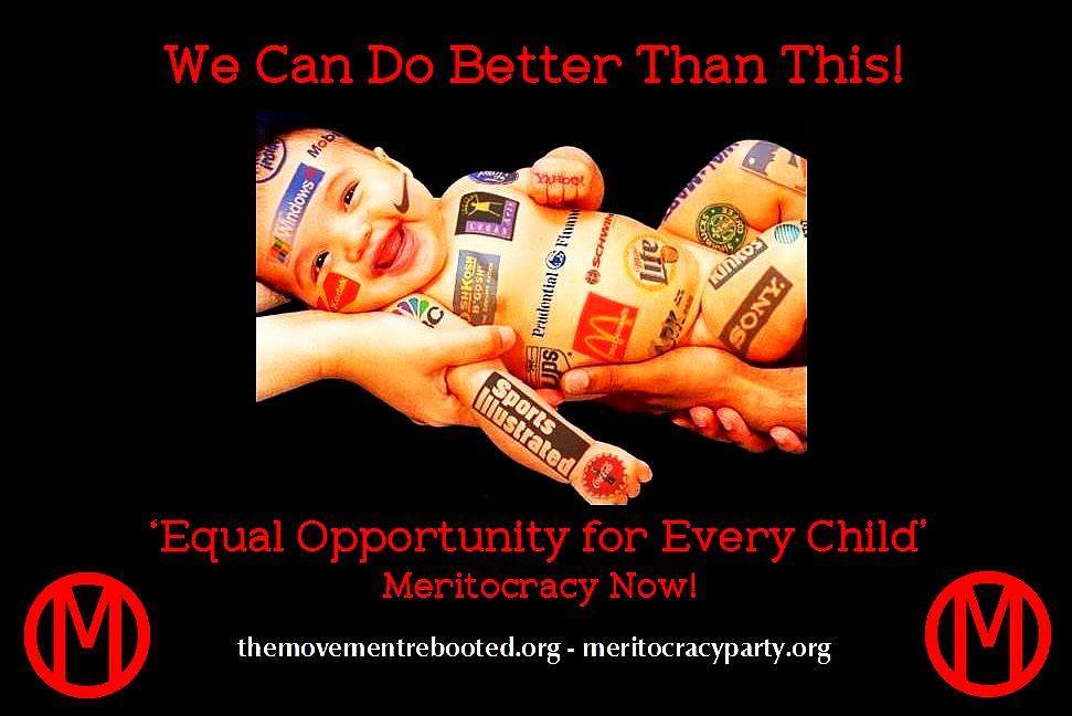
- The baby one could be a little controversial. There is a beer logo on the baby next to McDonalds. The imagery is very clever but using a baby in this context could be too controversial. Possibly if the baby is replaced with an adult it could be less controversial, eg an adult buying corporate goods.
There is some treasure in the MP chest starting to glisten. We have to get the chest lid more open and get a leaflet designed.
Overall - good and powerful graphics; and good ideas underpinning the graphs.
I was searching in google and there were a lot of images which can help. I am listing one which is good. It refers to the idea of innovation and breaking out of your comfort zone - http://60secondmotivators.com/blog/uploaded/Images/magichappenshere.jpg
I feel these are good ideas if there is anyone with imaging software to
design along these lines:
- The chain one: the padlock locks the world and the key is in the air.
I think the chains should fetter PEOPLE and the key is held by them
(showing we can change our lives if motivated). - The drain one has a very powerful idea behind it. I think the
"average person" referred to in the caption should be visually shown with a
contrasting image (MP words are enlivening people, other political words
only fit for the drain and journalists).
Any takers?
I think what is needed is a graphic designer. The software is generally free (there are even free image editing websites). Could someone from the US Meritocratic Party help?
I was thinking about the baby image, which has some very good graphics and hidden messages, and I thought also because the names of companies are used, they could complain about their names being used. The graphics in all the images were all good I thought.
There are a lot of “ball and chain” types of images which could be used. For “down the drain” idea there are also a lot images (because both are cliches and used in a lot of different contexts).
I can hand out leaflets in Southend when they get done.
@Ed_Chy Would you be up for creating a few mock-ups of some of the ideas on this thread? That way we can start to see their visual impact and assess which would be good choices moving forward :).
Our colours are white, black and yellow, although for UKMP we have mixed up the red and blue, as seen here: https://www.facebook.com/UKMeritocracyParty
I’m a graphic artist, happy to help but I need to see stick figure mock ups of what you have in mind, when you just write words I don’t know what you want.
Examples of my work: http://zeusthunderer.deviantart.com/
I will make some suggestions using google images, post them here, and we can see what other people think. I will also try and put something into a single image.
For quality of imagery, this link http://zeusthunderer.deviantart.com/art/Oscar-Pistorius-Pistols-538502156 shows the kind of image quality I think works.
I think the images need to communicate, opposed to just gratifying, so we should focus on the communicated message and use the image as a means to communicate it.

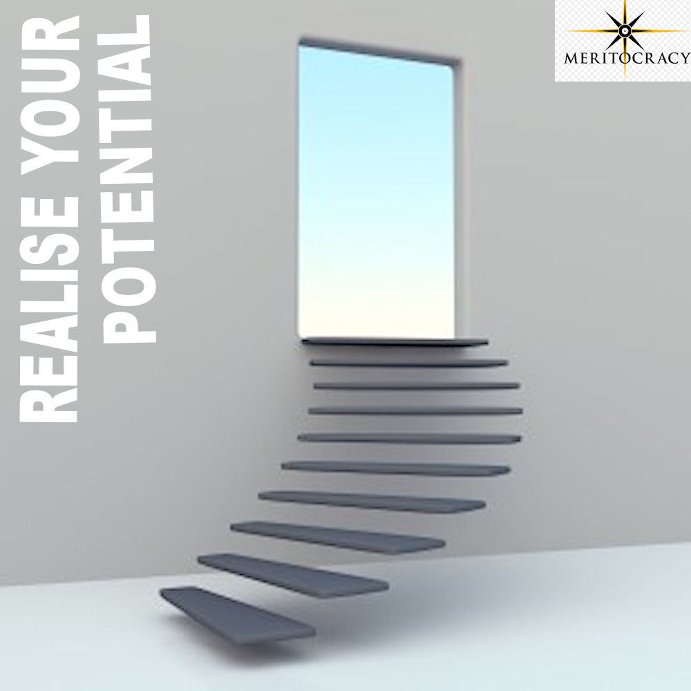
I used google images to create some demos which are intended only to generate a basis for the actual leaflet construction. These are more in the ideas category. I did see the stairway one which was not a ball and chain/ handcuff one but it was so good I included it.
I think these series of leaflets are more overviews of the MP principle set. I think later leaflets should focus on schools, medical care, etc.
We should probably copy tactics, wording and designs of flyers from previous revolutions that worked, what kind of flyers were used during the Cuban Revolution? the Russian Revolution? the French Revolution? the American Revolution? Let’s do the research and build on leaflet designs from those revolutions that were successful in the past. We can take those ideas and evolve them.
1 Like
I have seen a few copies of leaflets from the 19th century that caused regime changes and they mainly had a single focus.
1 Like